Product Overview
Illumio is a cloud security company with a web application that allows users to secure their data centers by writing whitelist rules. These rules allow traffic between workloads that have Illumio’s software installed to monitor traffic. The web application allows visual analysis and editing of the rules.
The Need (Years Ago)
When I first joined the company in September 2013, the UI was in rough shape. A lot of features were missing and the handful of features that were present needed work to become intuitive and easy to use.
My Immediate Goals
To redesign the layout and interaction design of the web app, focusing on presenting rules in a clear way and improving the dashboard.
The Challenge: Redesigning The Old UI
The existing design of the product when I joined the team needed a lot of work. The layout felt too much like an informal blog instead of a polished web app. A lot of concepts and interactions were also unintuitive.
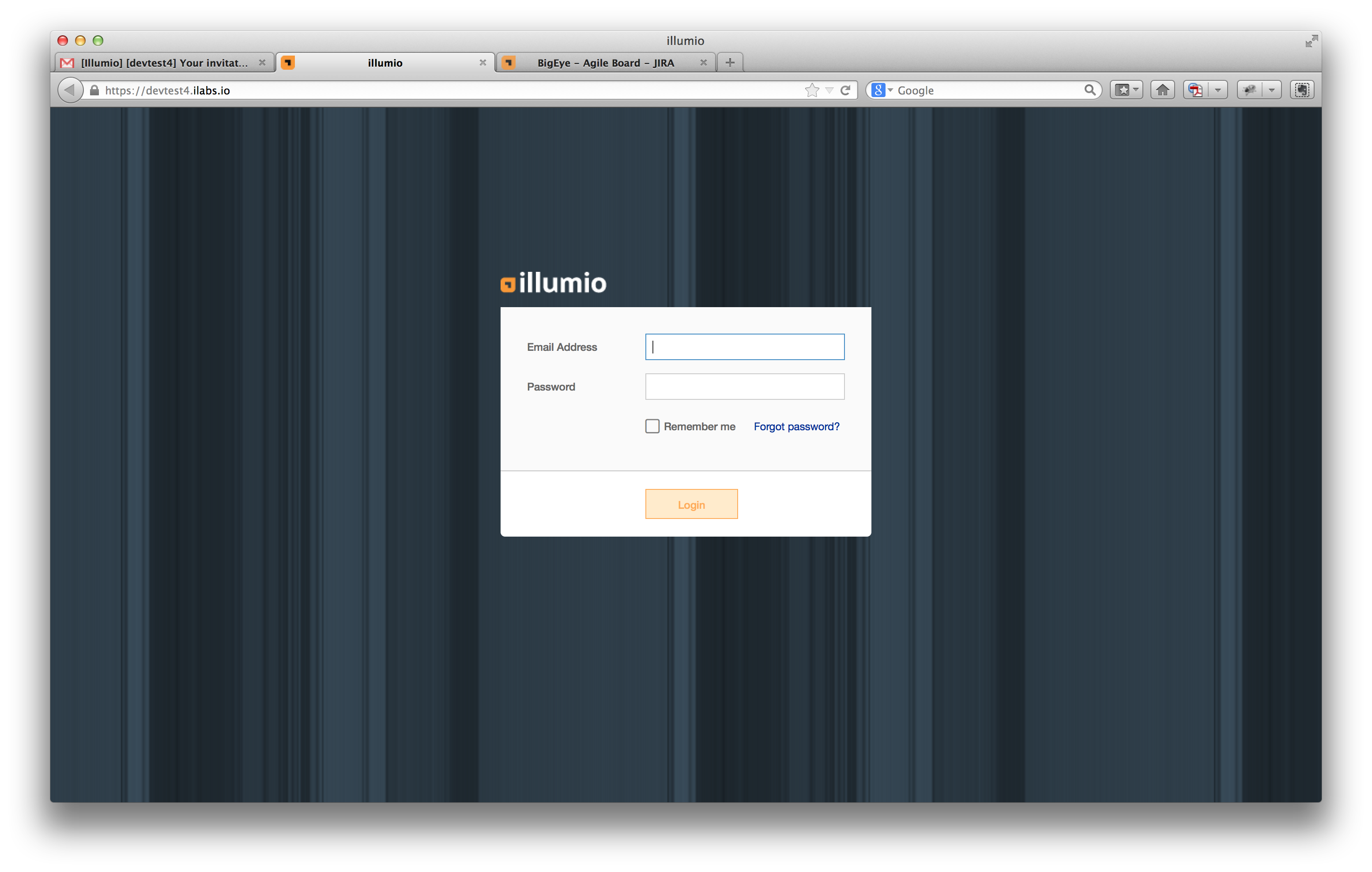
The old login screen
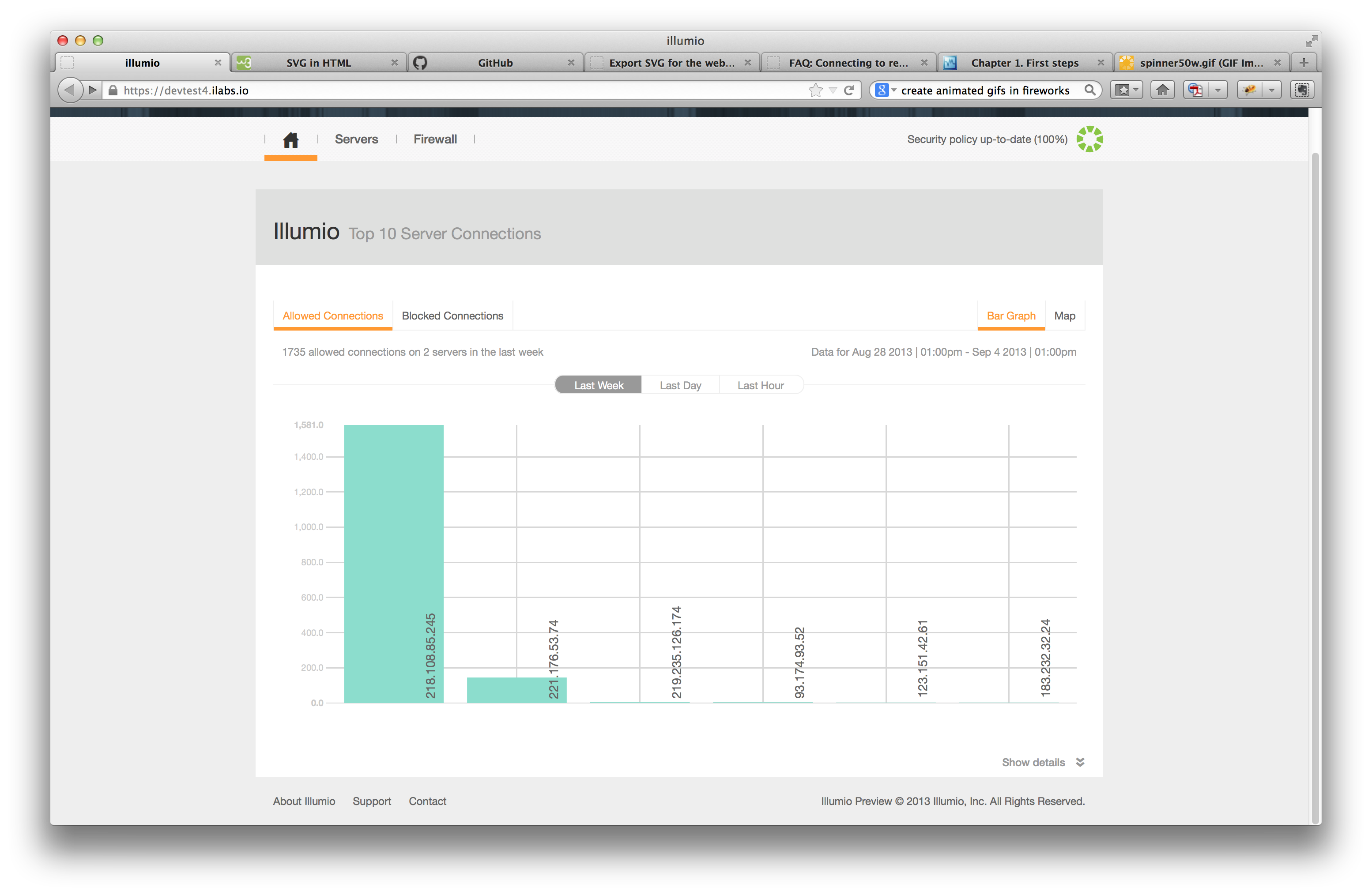
Dashboard not very useful
Hard to decipher information
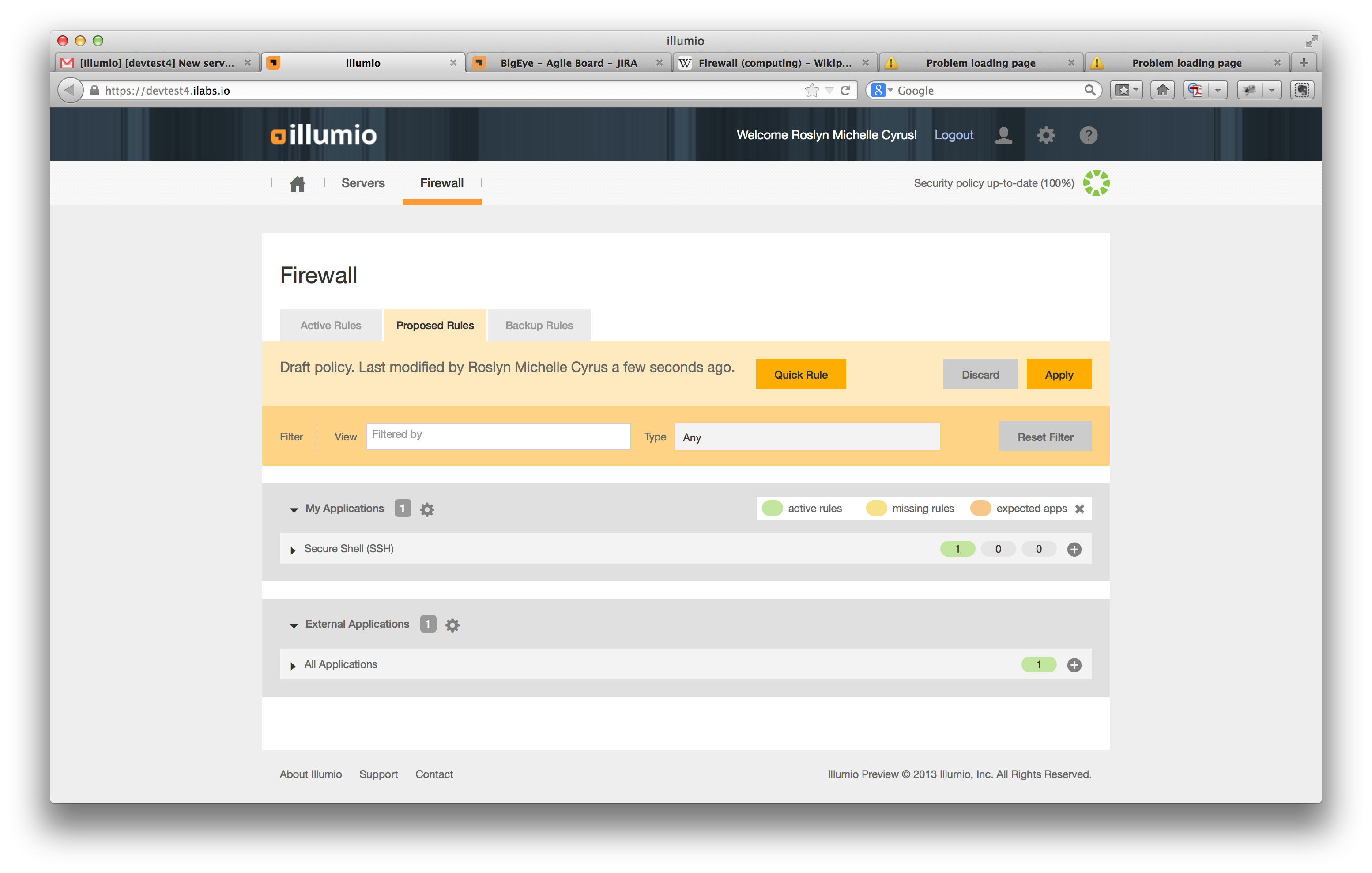
Rule-writing not intuitive
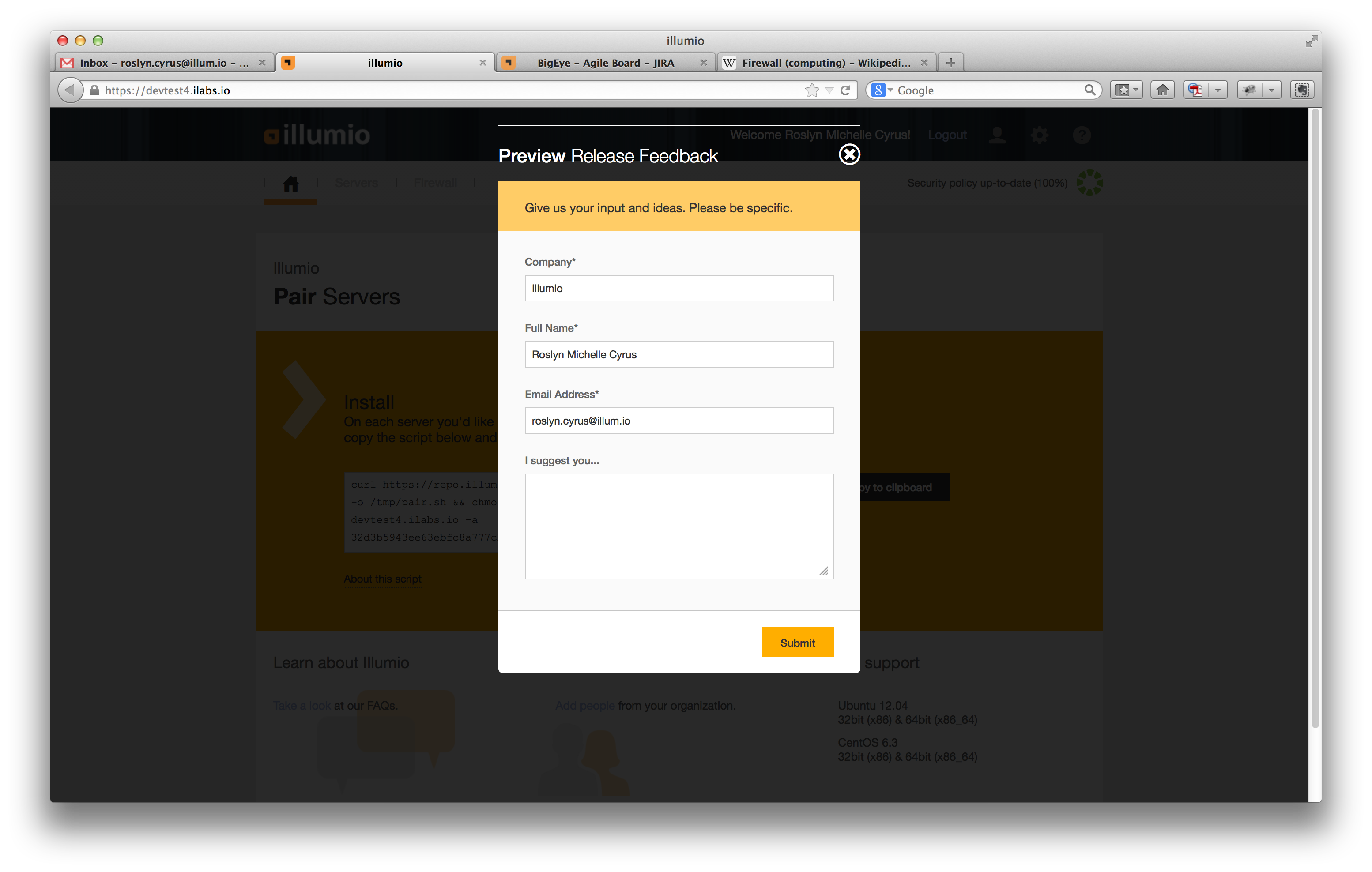
Imagine the feedback we received! :)
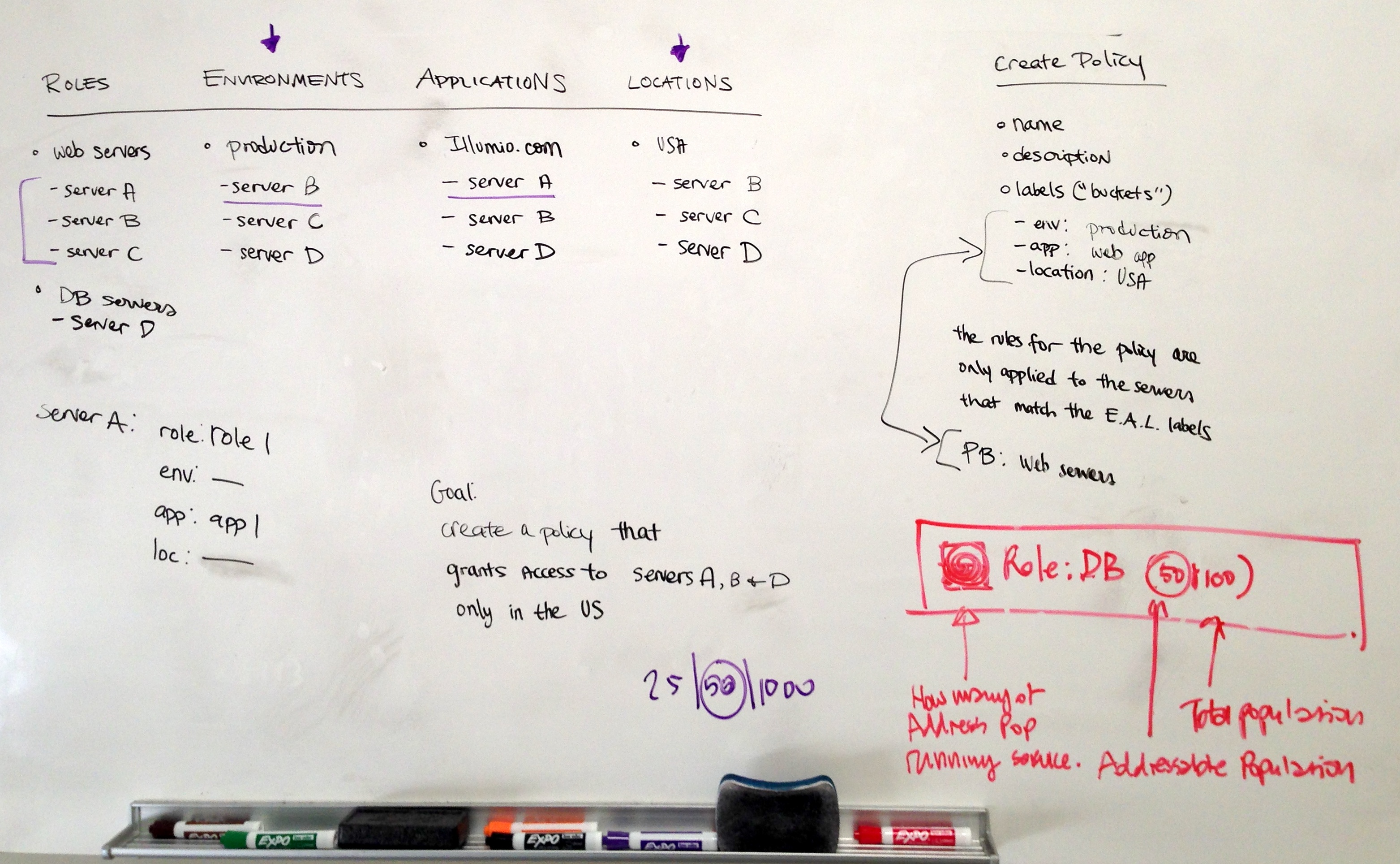
Whiteboarding
Whiteboarding with our visual designer was crucial to brainstorming ideas and understanding complex features.
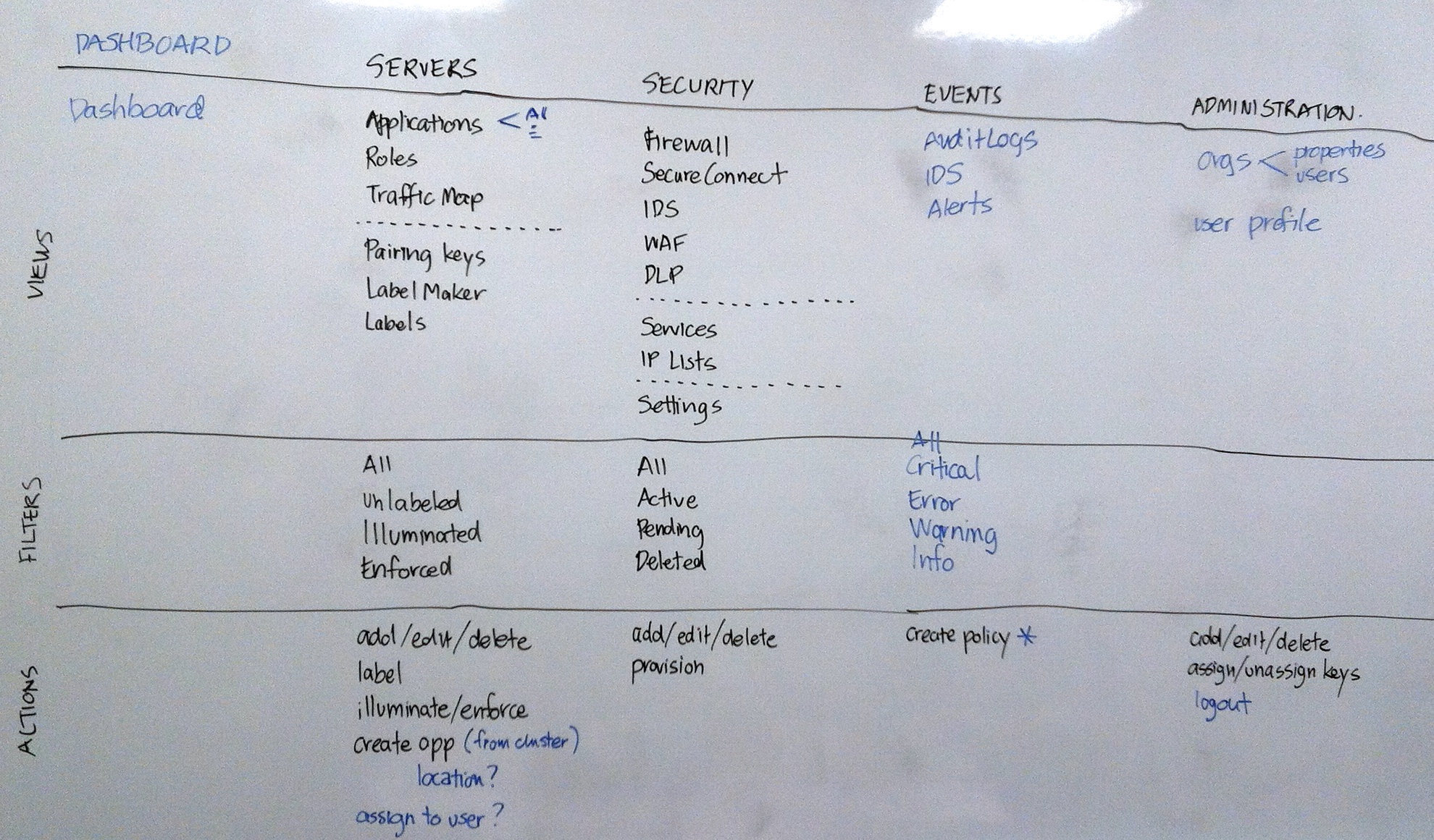
Working on the navigation
Understanding labels
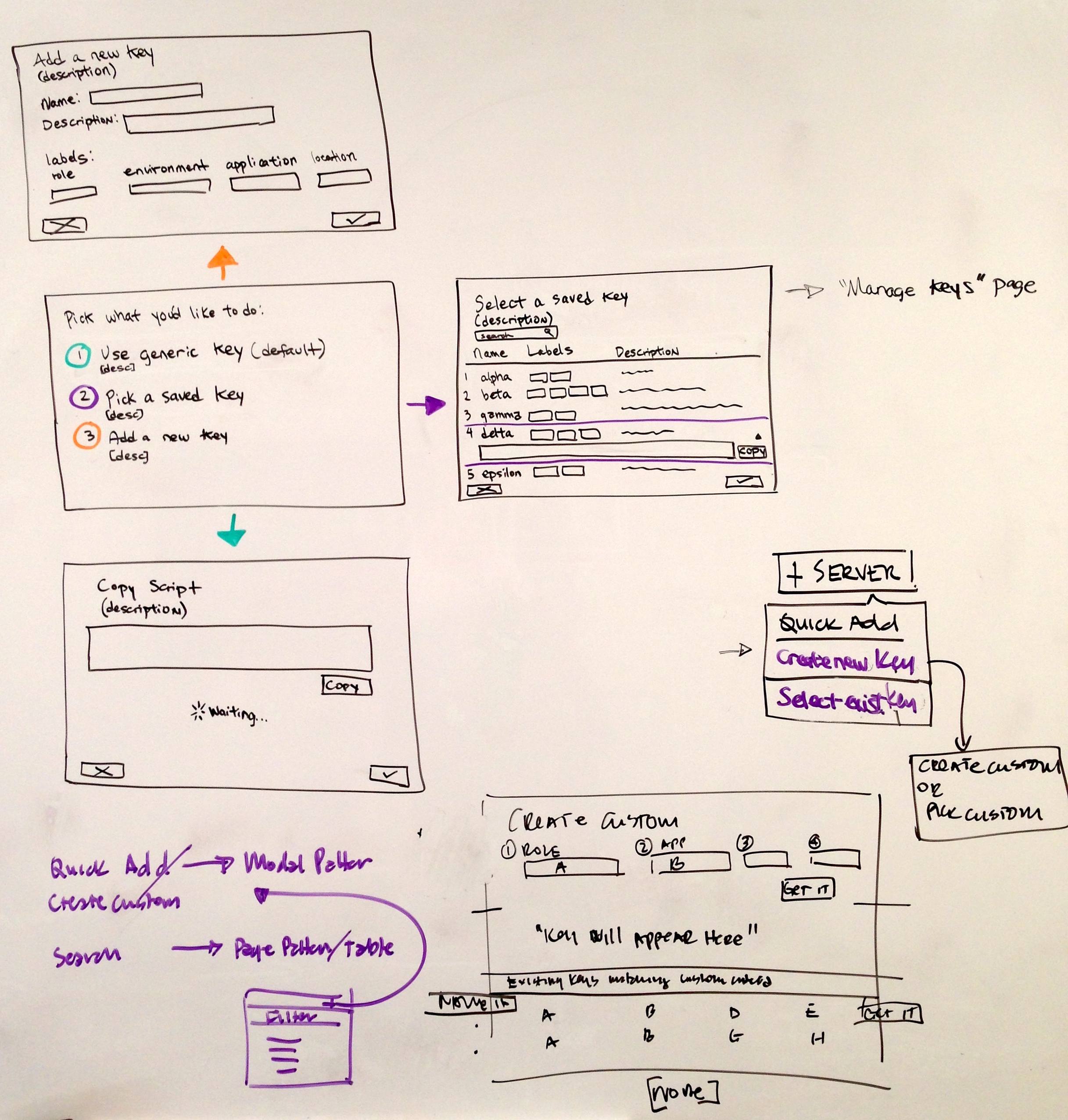
Creating custom pairing keys
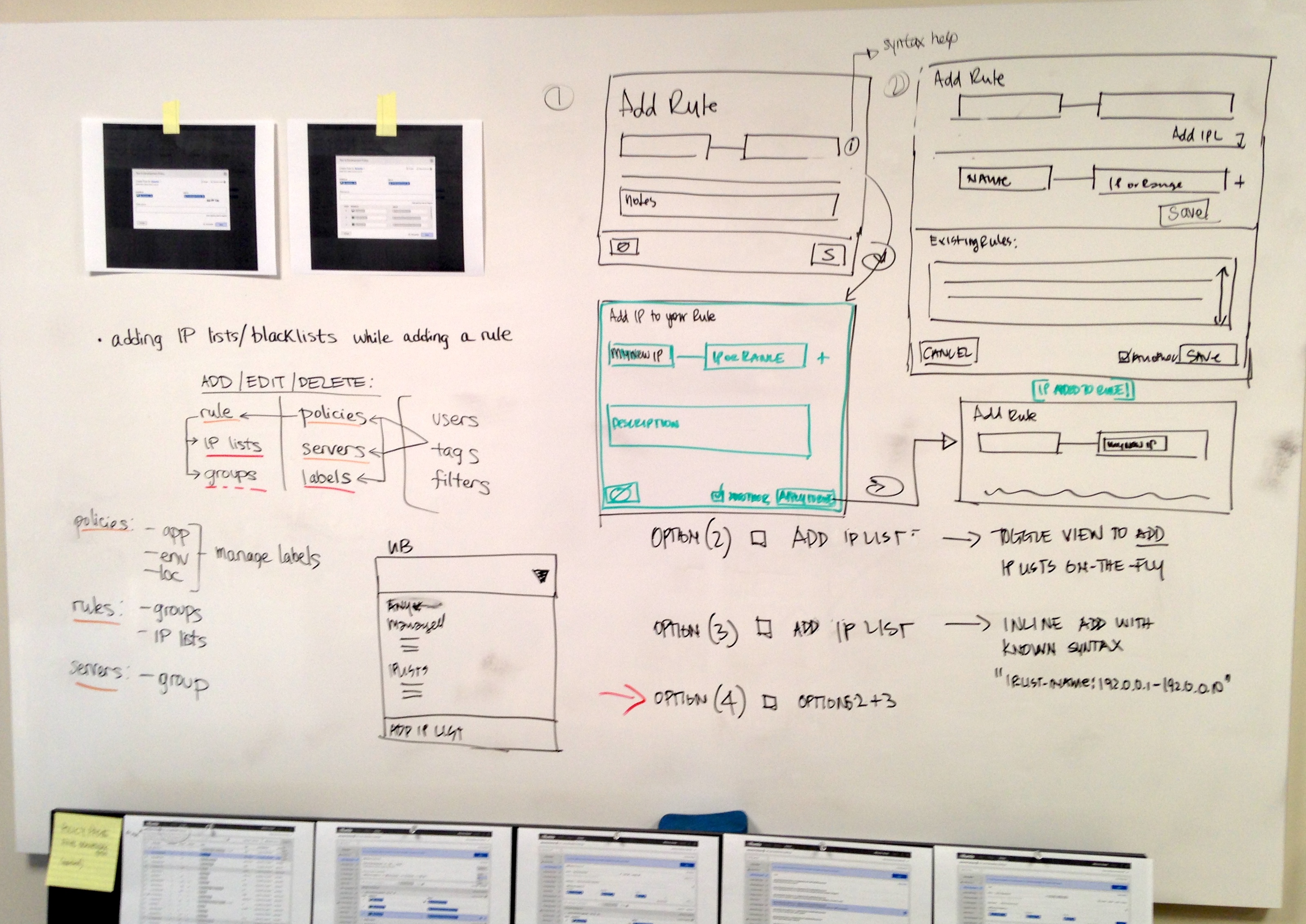
Rule configuration
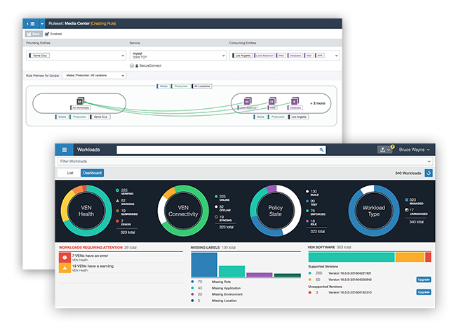
Designing The New UI
I worked with our visual designer to create a more polished design while focusing on a layout that feels and behaves like a web application.
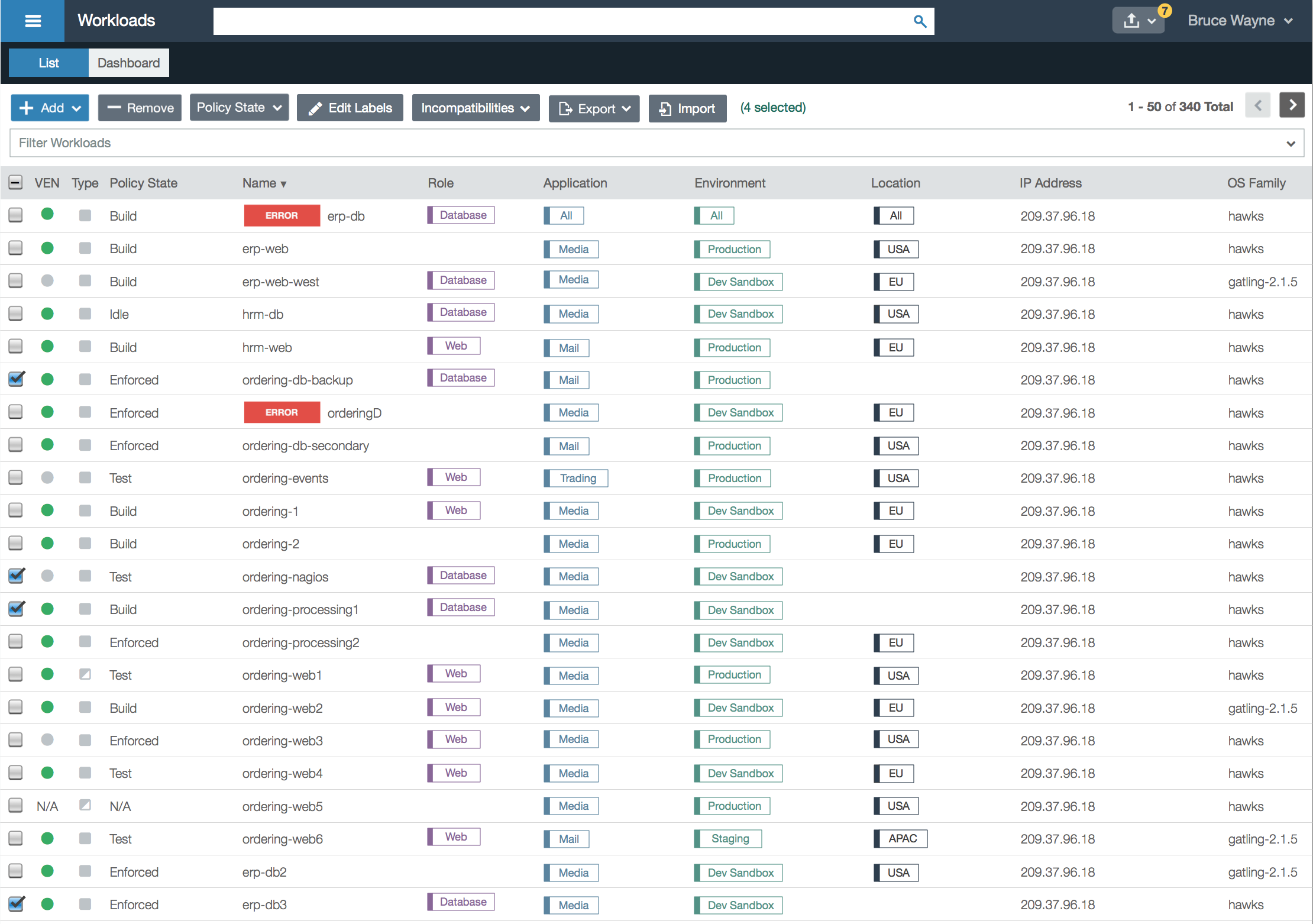
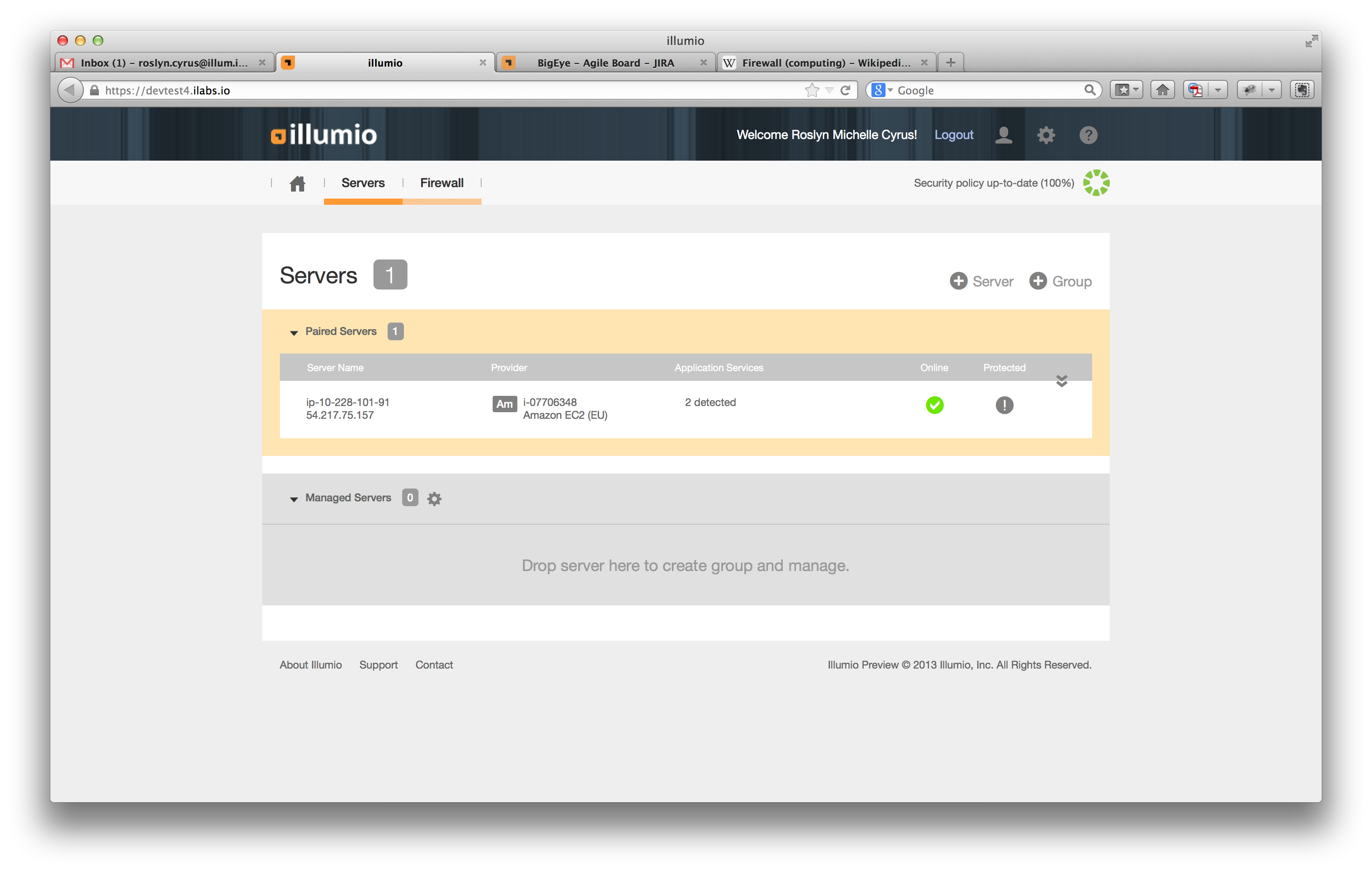
Workloads (servers) list
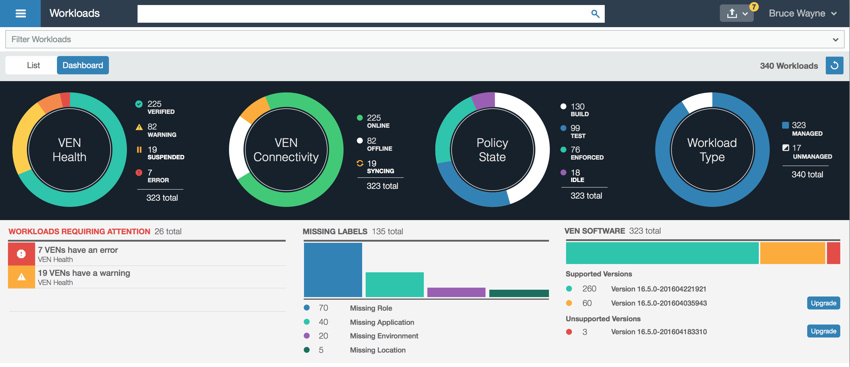
A more useful dashboard
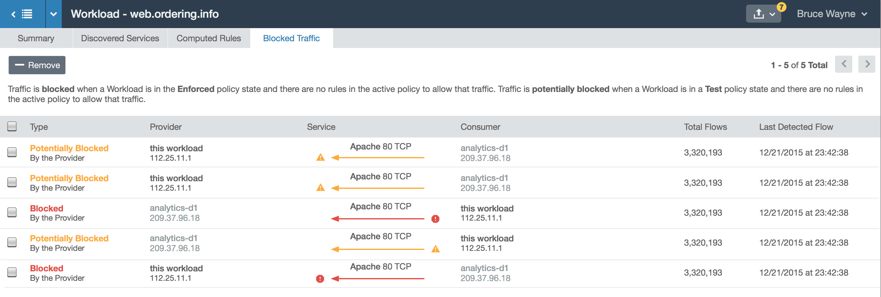
Blocked and potentially blocked traffic
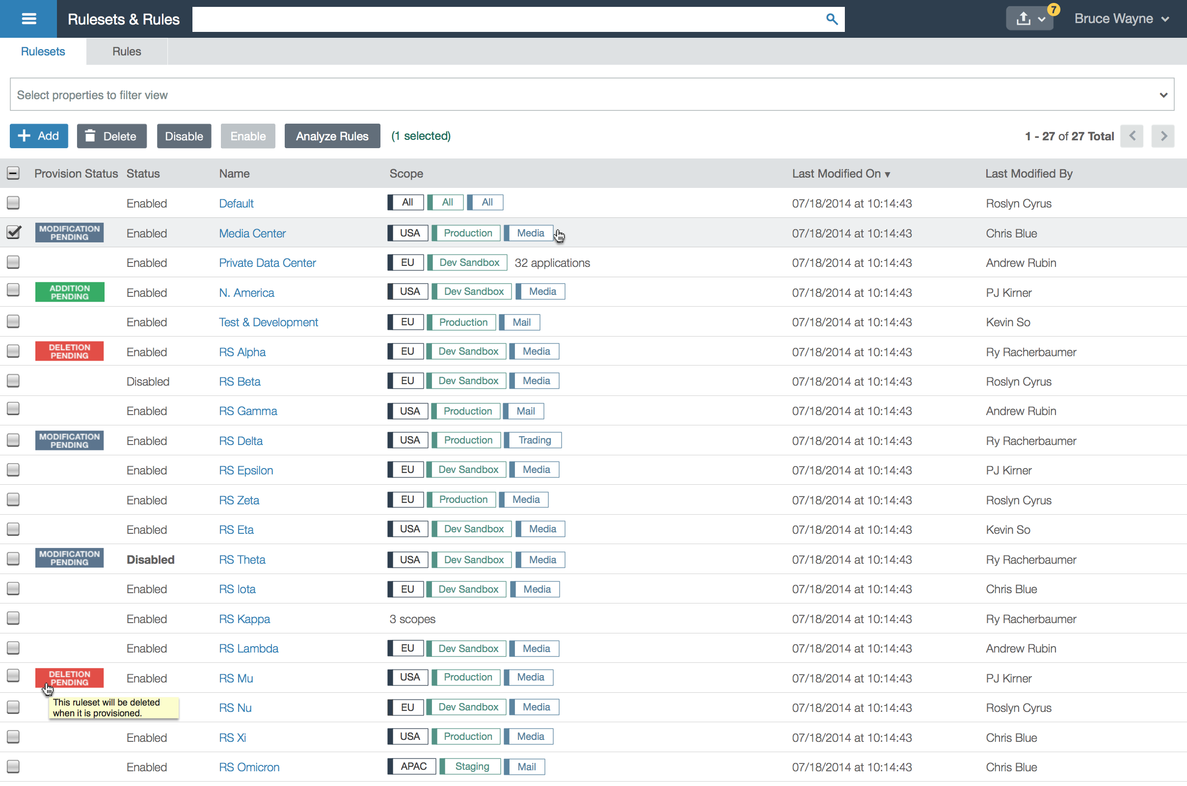
List of rules
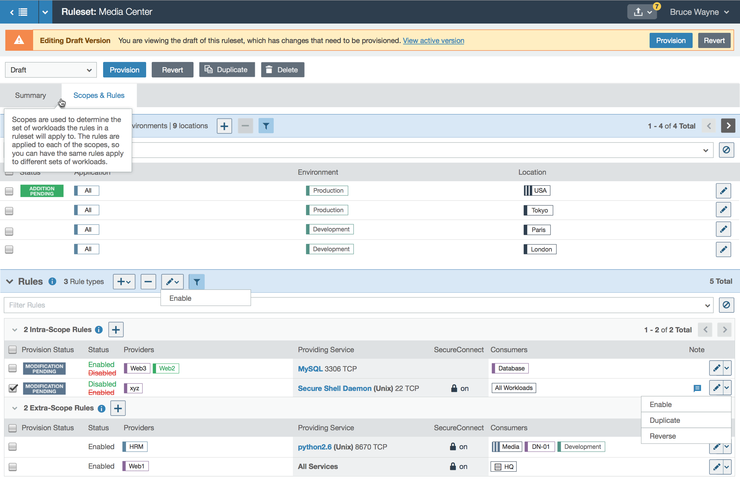
Ruleset details page is clearer and cleaner
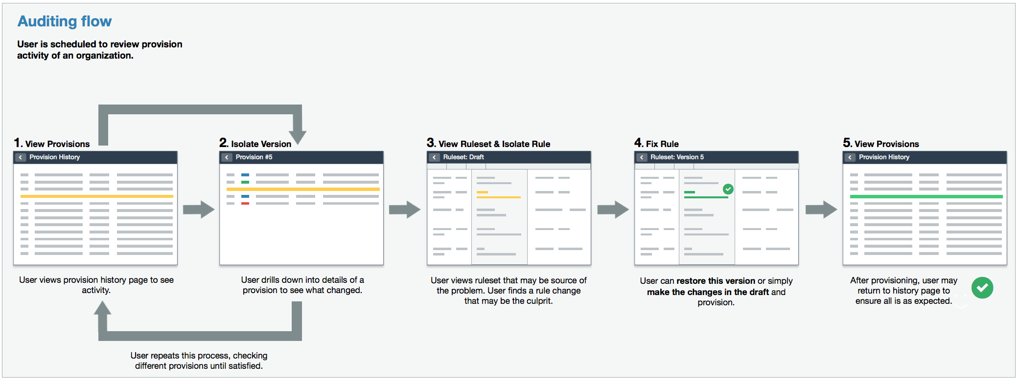
More of My Process: Flowcharts and Patterns
My general approach to design is to define patterns to avoid having inconsistency across a product, which can quickly become unmanageable in large applications. I created and stored patterns and components in a component library created in Sketch.
Flowcharts also help to think through use cases and are especially helpful with discovering edfine tune. Flowcharts also make it easier for engineers to capture all scenarios in their code, and I find that they make it easier to “translate” a design.
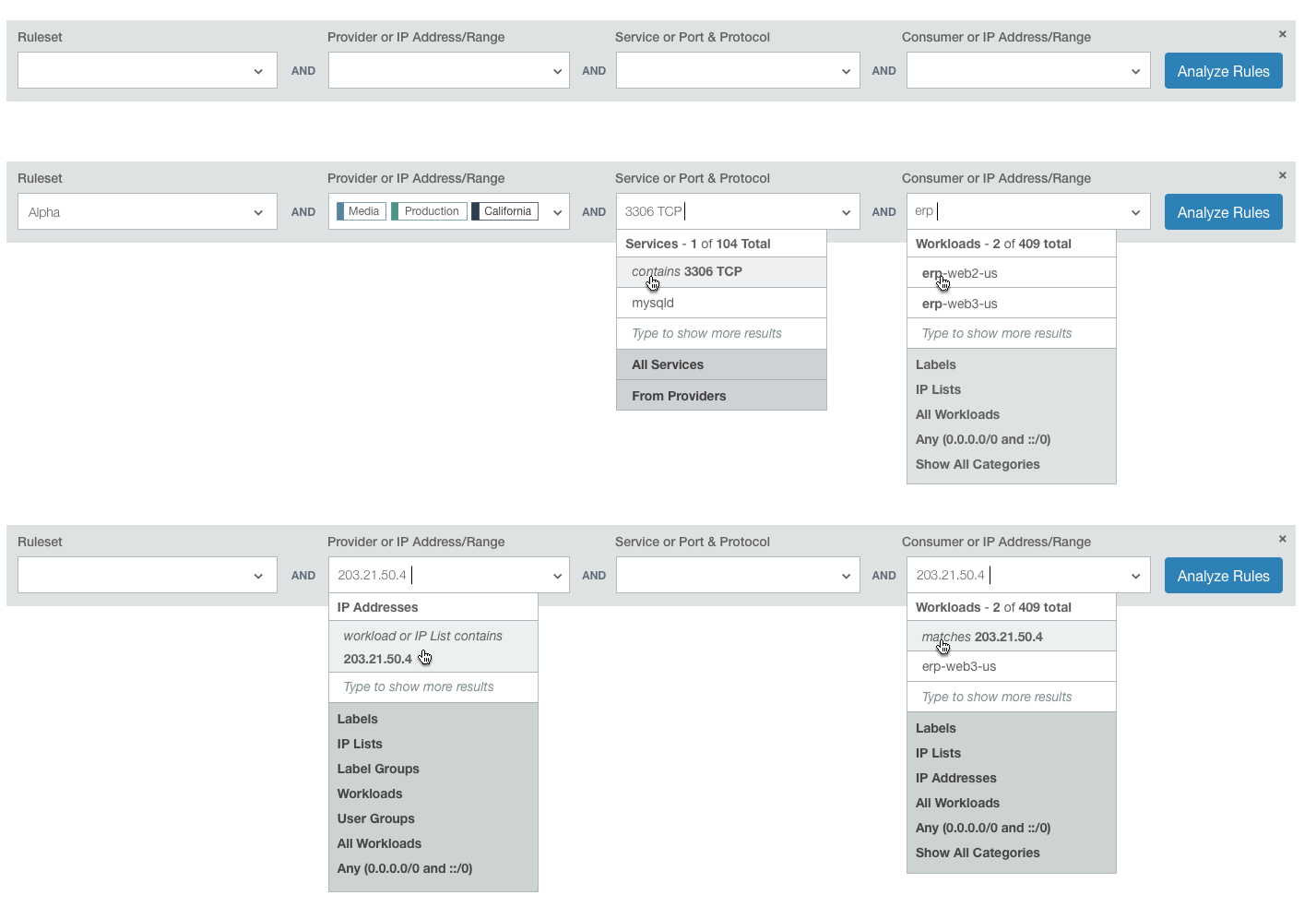
Filter pattern

Flow chart example
High level page transition flow
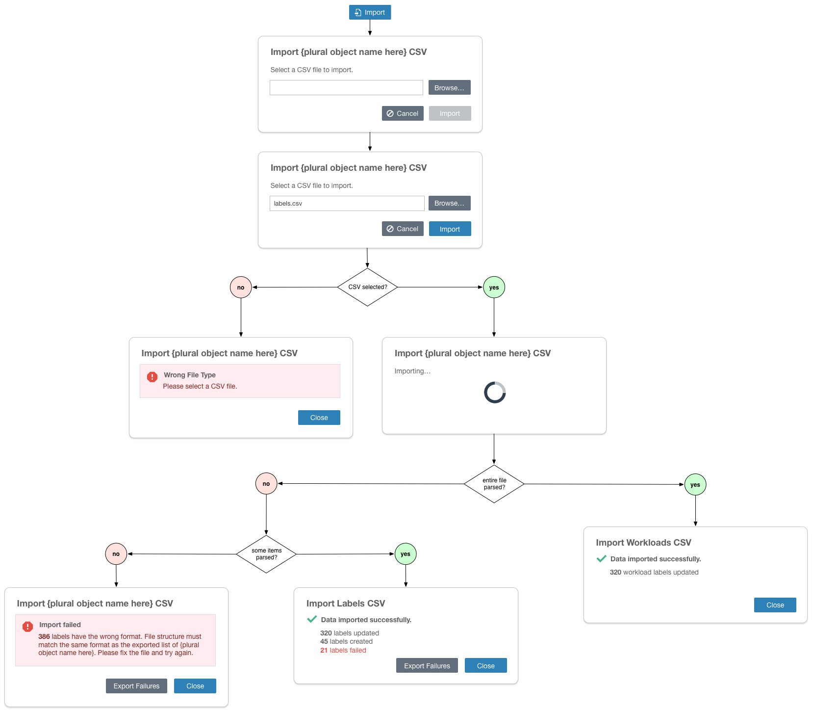
Flow chart with modal pattern
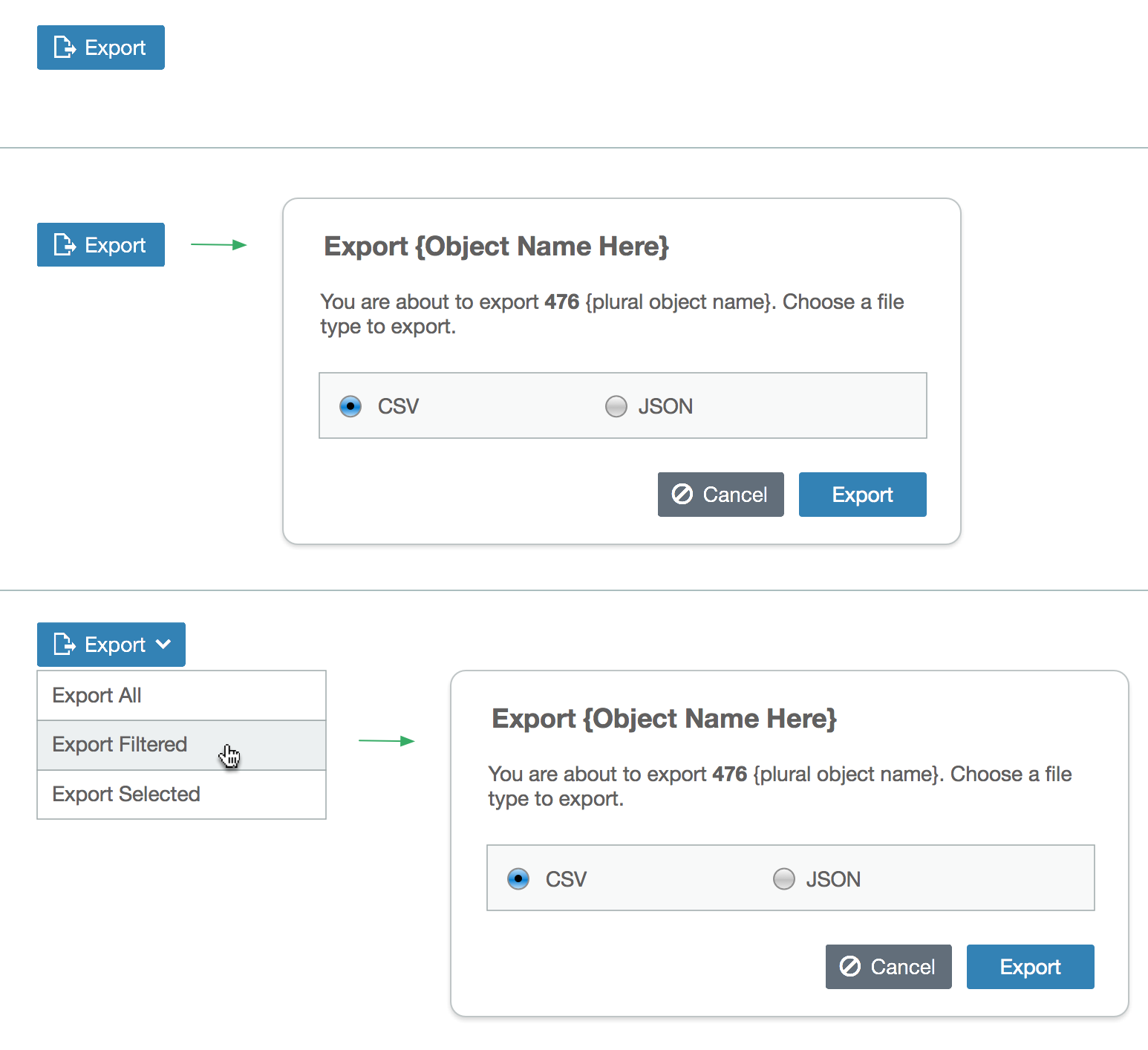
Export modal pattern
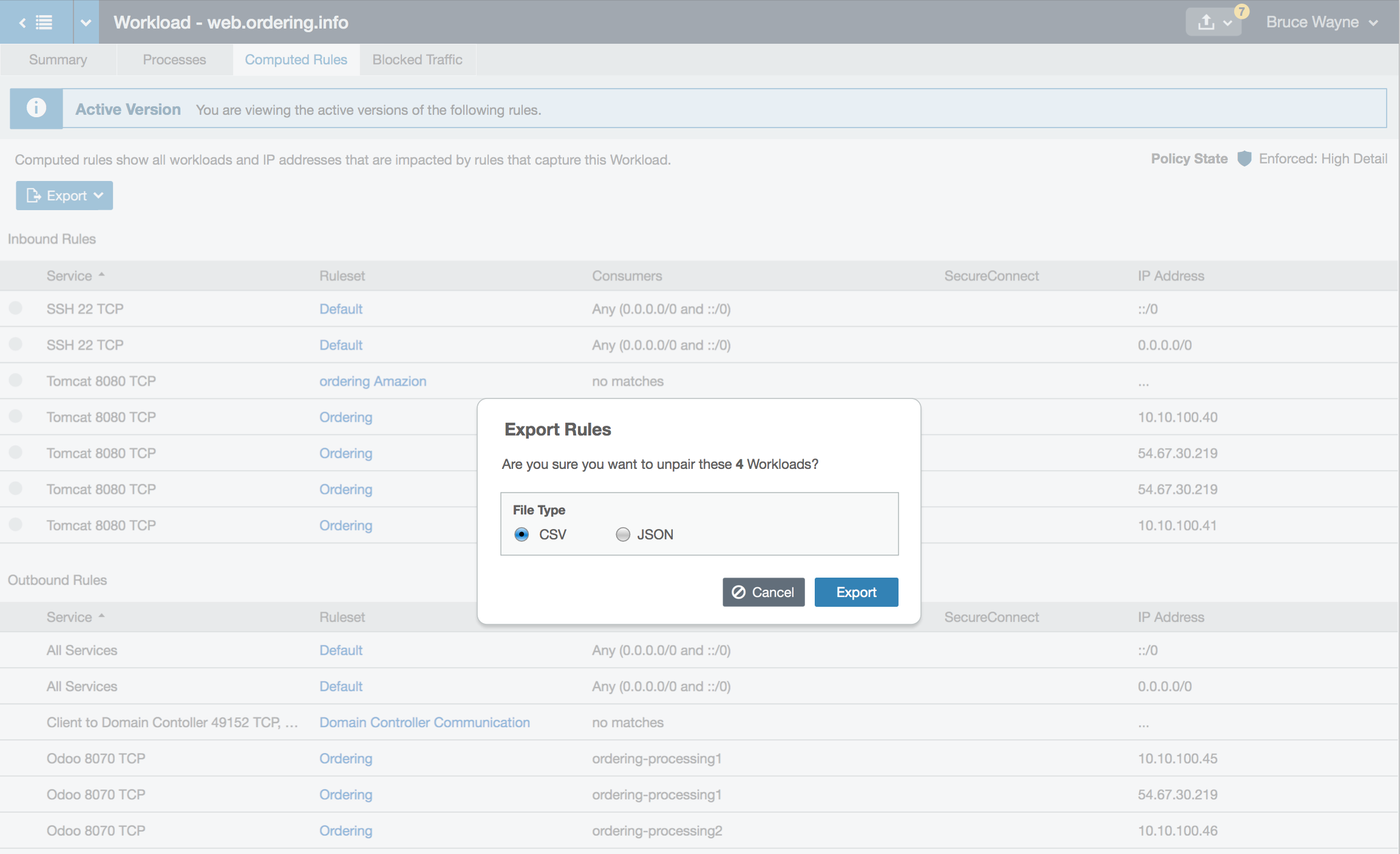
Export modal example