This is my last quarter at Stanford before I graduate, which is a bittersweet experience for me. I am taking my last two classes before getting my MSCS degree, so it was important to me that I take classes that I would immensely enjoy and learn from. In addition to CS155, I’m also taking CS377G: Designing Serious Games. This class deep dives into what it means to create compelling games that captivate and enrich the lives of their players. It has been a whirlwind of a class in the very best of ways, and for my second class project, I had an opportunity to combine all three of my loves: writing, designing, and developing! The premise of the game is to use interactive fiction to drive the narration of a story by giving the player choices that influence the outcome of the game. Game layouts can range from all text to a mix of text, sound, images, and other media to create a “choose your own adventure”-flavored experience. I like to think of the platform as a digital version of the Goosebumps books that I used to read as a teenager.
For the project, I had to come up with a dystopia that represents some facet of our society that could worsen in the future. Without giving too much away, the storyline features the main character Riley who has everything she wants in life except a life partner. She ventures on a dating app journey and slowly comes to realize that this app is not like the others. How will she come to terms with the way the app behaves? Play the game to find out!
NOTE: to avoid spoilers, I recommend first playing the game.
The Game Concept
The idea for this game came to me as I thought about things that I believe are already becoming negative trends in our world, namely, our addiction to devices and social media. In particular, I’ve thought a lot about the “swipe left” dating culture that so many people of my generation experience as we explore dating apps. I’ve been on a few dating apps recently and I always have this slight feeling of guilt every time I ignore or skip a match. How can someone get a sense of one’s compatibility with a person based on a list of stats and a few photos? It seems harder and harder to get (and keep) people’s attention and I find that browsing through so many profiles has desensitized my ability to see the people in the profiles as actual people. It is almost as if people have been reduced to a stat sheet: a selfie-filled resume, a digital dossier of mostly meaningless facts that say little about the true character of a person.
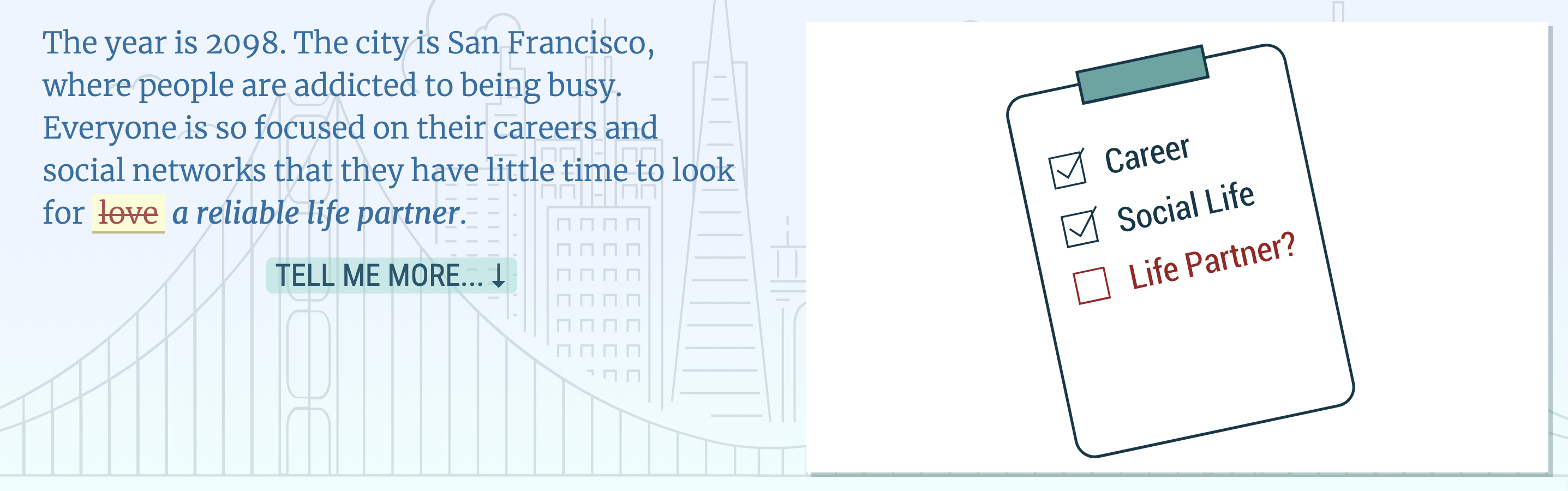
Because the dating app world is one that is very personal to me, I decided to make that the focus of my app. To frame the game world, I came up with a map that represents the places where Riley has most of her experiences. The setting is San Francisco in the year 2098. The map is comprised of three “locations”, two being digital and one physical: the dating app, her text messaging app, and Golden Gate Park. Early on, it became apparent that in order to make this story feel like Riley is sucked into the digital environment from which she is constantly trying to escape, I had to build a system that would allow the player to interact with the apps in a way that feels eerily familiar. Designing the game took a good amount of time but I believe it was worth the effort. My original text-only version of the game didn’t have the right mood and it was important to me that the game feels interactive versus simply narrative. This was my way of reinterpreting the interactive fiction medium in a way that I feel benefits both the story and the gameplaying experience.
My first grand idea of the game ended up getting cut down to size, but I’d like to give you a sense of what my initial thoughts of the game were.
The Original Game Idea
It is sometime in the near future, in a world where online dating has become a perverse and extreme exercise. Long gone are the days of simply swiping left or right to find your future partner. That was the beginning of the downhill trend of quickly scanning your matches. People found themselves too busy and impatient to meet people organically in the real world and sought a more effective method to ensure the likelihood of meeting a solid match, someone who would be worth the time and money.
Enter Match/Made, the dating app that attempts to solve this problem. In a game world based in the Bay Area where people are busy managing their careers and online social lives, people browse an online catalog of potential matches. Instead of a mere batch of profile photos and bios, however, the stakes have been raised: people can browse matches the way they browse for Amazon products. This “try before you buy” dating model allows you to “try” your match for 30 days; if you aren’t completely satisfied with the recommended match, you can cancel the trial at no cost to you. If you enjoy the match, your credit card is billed accordingly. Additional features include adding matches to your wishlist and even having other friends gift you with a match. It’s “window shopping” for the fast-paced dating world. In its most extreme dystopian form, it is an escort service where people “play for keeps”: the end goal is to end up with your perfect match, but the system has evolved in a way that causes people to be less empathetic and less connected. Many people find the system “successful”, but at what cost? The new cultural norm in this world is that people expect to meet their significant others this way. Those who don’t (who opt to meet people the “old school” organic way) are socially outcast for not finding their match in the “ideal” way. This is a reversal of current norms where online dating is not as common as meeting people organically (although this is starting to shift; the extremity of this shift is what inspired this idea). This introduces an opportunity for the main character, who grows to see that the system is majorly flawed and takes a risk to get to know someone in real life.
Goals
The goal of the project was to come up with a topic that would bring players awareness of the hidden message in my dystopia. My hopes are that players will feel a sense of self-awareness when it comes to their interactions with dating apps and generally the “fast food” consumption of online information via social media and other sources. Overall, the core values that I tried to highlight in this game are love, empathy (in contrast to apathy), and self-discovery. Overall, I feel good about the impact that my game has. I think Riley’s journey is an experience that many people can empathize with. Let’s dive more into her journey.
Riley’s Journey
The game starts with you learning a bit more about the world you live in and who you are. You are introduced as the main character Riley and you get a summary of what the app Match/Made is all about. You may or may not notice that the word “love” is not popular around here. You were on a waitlist for the app since its success rate has it in high demand, and now it is finally your turn to use the app. Once the app loads, you may notice that it uses personal information about you such as your social status, resume, and even psychological reports to determine whether you’re a good fit.
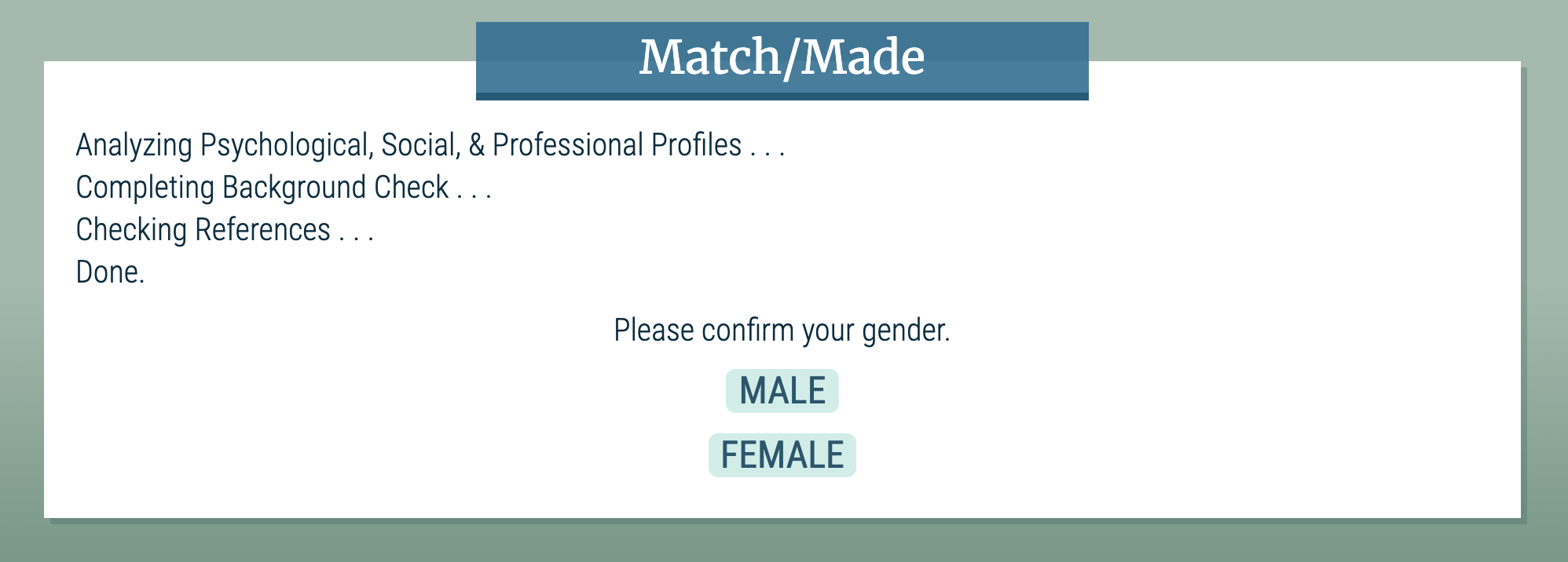
The background check
Once your background check passes, you confirm your gender and the gender of people you’re interested in. This choice influences the language of the game. Then you’re taken to the app’s dashboard where you realize that you need to wait before seeing matches. To streamline this waiting process, the game tells you about your sponsor, who is there to assist you throughout the dating process. You interact with your sponsor via a text messaging app. Speaking with your sponsor gives you more insight into the psyche of not only others in this world, but also yourself: you start to ask questions that reflect either a positive or negative experience with the dating app.
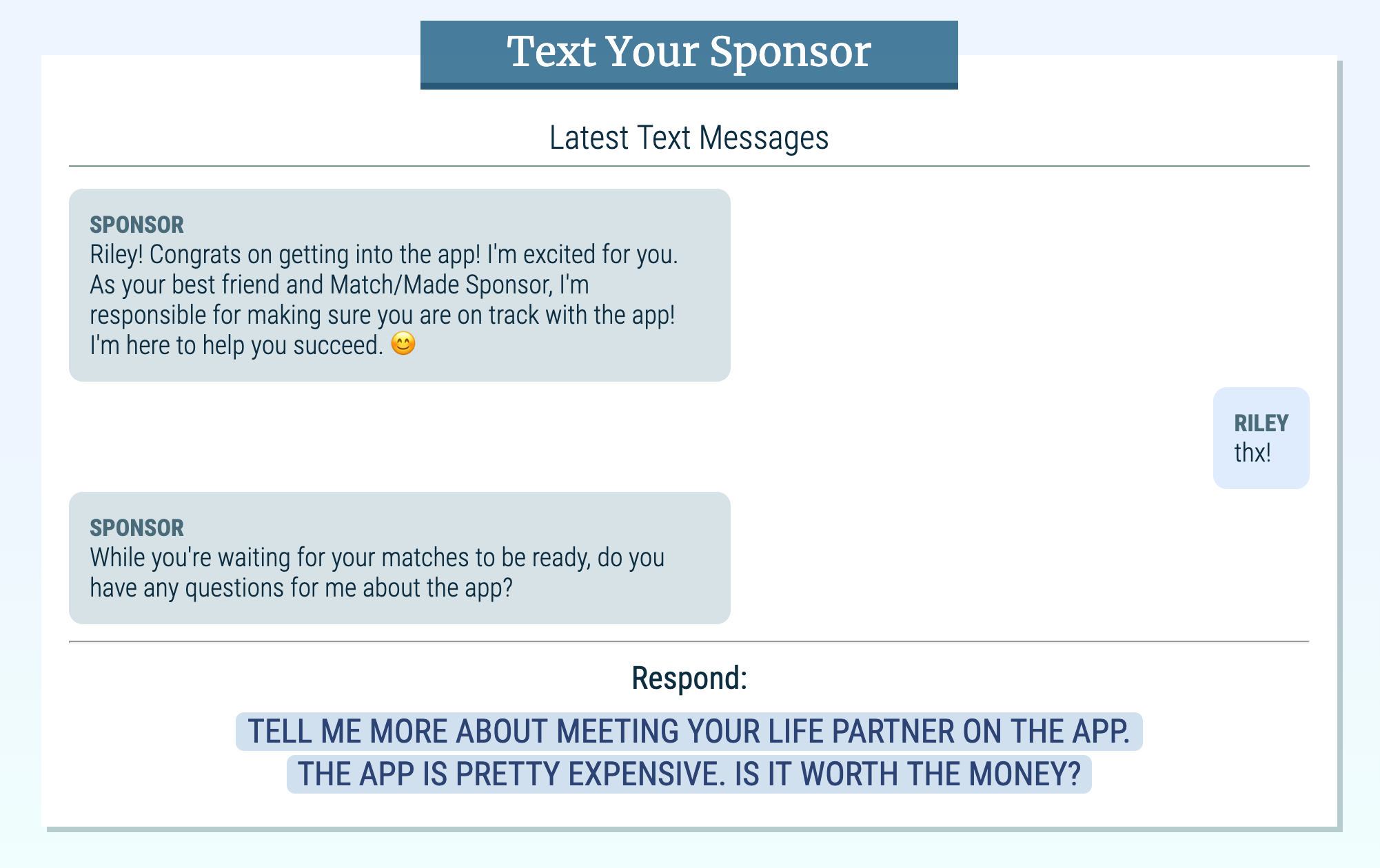
Texting your sponsor
In addition to using the dating app and texting your sponsor, you can also go to Golden Gate Park for some personal time and introspection. It is in this park where you really come to understand Riley’s experiences. This is where most of the narration occurs and it provides more prose-like insight into Riley’s mind.
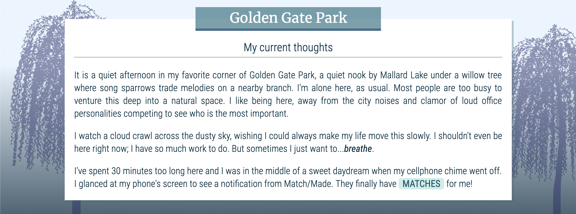
In the park
Eventually, you get matched with people and have a chance to browse through the candidates. In order to reinforce the idea of mindlessly rejecting a bunch of matches, the app forces you to reject a certain number of matches before you can accept any matches. This design choice seems to resonate well with players since it requires clicking through a bunch of profiles before getting to a state where you can accept a match. It builds tension and emphasizes the action of repeatedly rejecting matches.
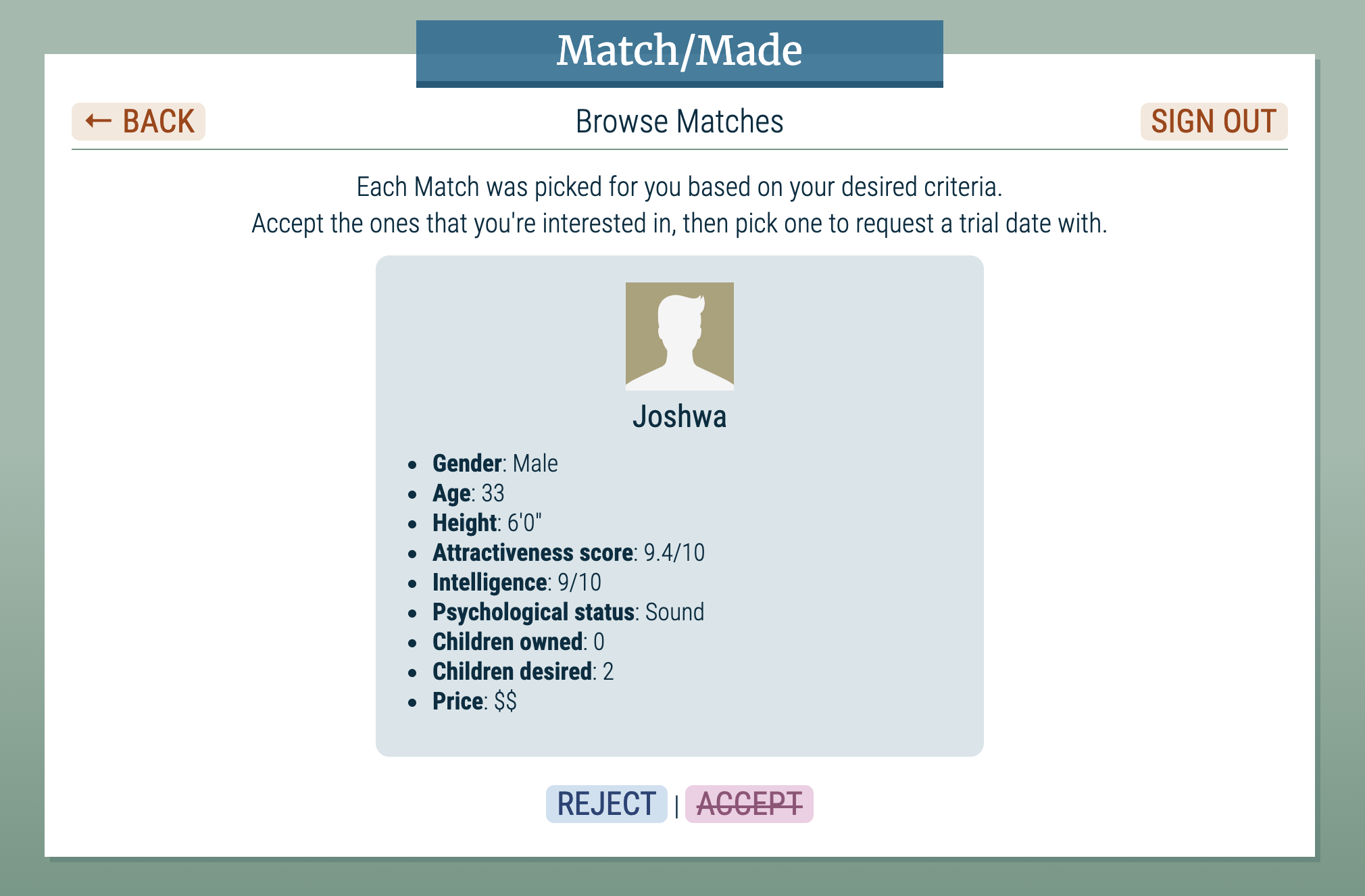
Browsing matches
Once you accept a match, you have to wait for your match to show mutual interest. While waiting, you again text your sponsor and go to the park to gain more intel and reflect some more. Then you are able to go back into the app and start a 30-day trial with one of your mutual matches, which launches a video conference date with the match. The date starts off normal enough until using the word “love” gets you rejected by the match and results in your Match/Made account getting suspended because of your “emotional distractions”. It becomes more apparent that dating in this world is transactional: people want a life partner to provide stability and produce offspring. Love is not a factor; empathy is not a concern.
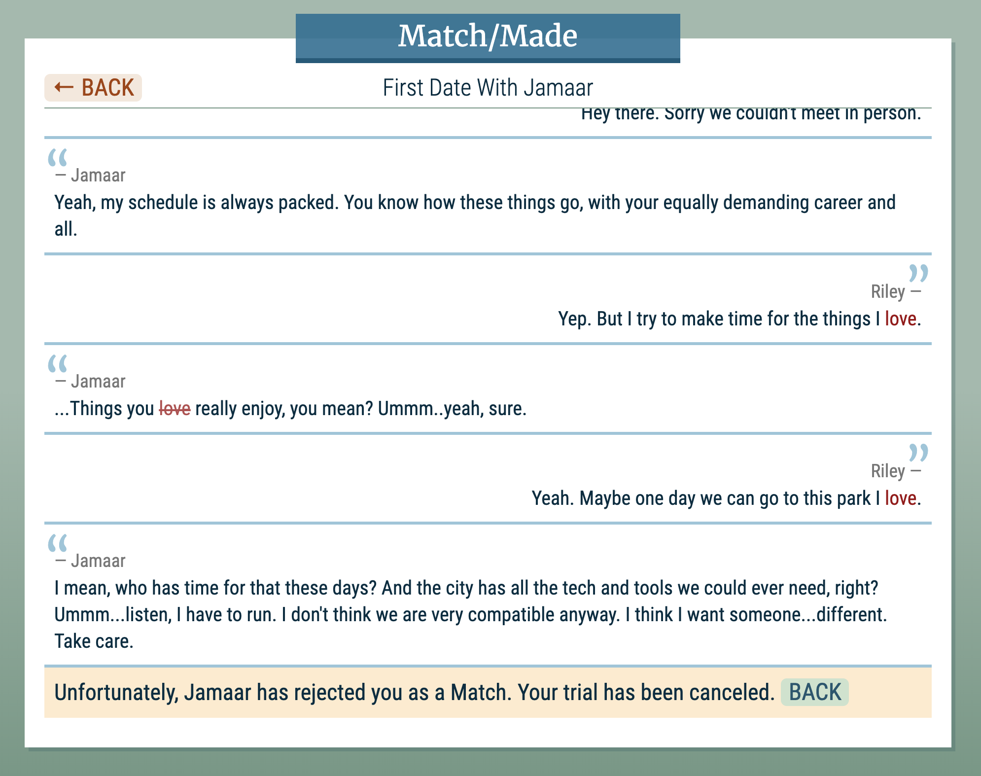
Rejected!
You speak with your sponsor, who tells you that she needs to reevaluate your psychological profile before recommending that your account be reactivated. You go to the park to clear your head where the unexpected happens: you meet an intriguing person who seems to share your sentiments about love and the world. You have an important choice to make: take a chance with this stranger who you met organically or wait for a chance to find your life partner on the highly regarded dating app. Which choice will you make?
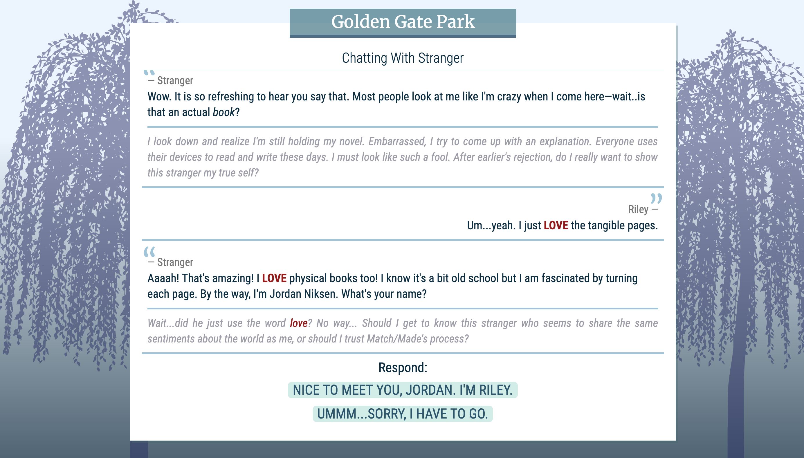
A stranger in the park
Playtesting
I started playtesting once the framework of the game was in place. I got excellent feedback from friends, classmates, the course staff, and my awesome mom. To validate whether I succeeded in bringing this awareness into people’s minds, I had playtesters fill out a survey before and after playing the game. Most people agreed that they felt more aware of the dating app situation and how our empathy can be impacted by a culture of quickly browsing through and processing digital data (both inside and outside the dating app world).
Some minor improvements included rewriting the introduction to not give too much away, making interactive links more obvious, and making the navigation more intuitive. More major improvements involved making the flow of the game easier to understand and streamlining the text conversations.
Version 1 (first round of playtesting): One of the professors, Chris, playtested the first version of the game and only got halfway through before clicking the “Restart Game” button. The restart button was on the home page of the game from the beginning but he didn’t notice it until halfway through gameplay, so by the time he saw it, he thought the game was over and so he decided to restart it. Because of this confusion, I removed the button and only show it at the very end of the game. Tommy, one of the course assistants, also played the game early on and recommended developing Riley’s story more. To address this, I added more detail in the text message conversations and introspections in the park. I also initially had a typewriter effect that would write out text on the screen character by character in the intro sequence, but Tommy said that it felt too slow so I instead have the intro text fade in. I think this was a much better design choice. I only use the typewriter effect when the app is first loading, when it checks your background and profile information. I feel this adds to the drama of the app scanning your info before letting you into the system.
Version 2 (second round of playtesting): Matt, the other course assistant, recommended not giving away the dystopian nature of the game in the introduction scene. I simplified the introduction so it wouldn’t be too revealing. He also recommended adding some more tension in the browsing sequence of the game, which inspired me to come up with not letting players accept matches until they’ve rejected a certain number of players. This reinforces the idea of mindlessly and quickly rejecting matches. One of my classmates, Nick, also recommended making the call-to-action buttons bigger because he didn’t notice them right away. I fixed this as well.
Version 3 (third round of playtesting): my mom thought that requiring 30 rejections before being able to accept matches was too much, so I reduced the number to 10. She also found it hard to know what to do next at some points in the game, so I provided instructional/help text along the way to guide the player as to whether to go to the park or text the sponsor next.
Because I got very ill and fell behind on my project, I found it hard to find more playtesters at the last minute but my mom was my hero! Since she lives in Florida, she did video conferences with me while sharing her screen so I could watch her play the game. She gave me invaluable feedback that greatly improved the flow of the game.
Mom playing my game
Feedback
Having both digital and physical areas of the game seemed to resonate well with people. The visual design of the game was also well received. After playing the game, playtesters also seemed to have an awareness of the culture presented in the game. One playtester gave the following feedback:
The game was really good! It definitely made me feel slightly more guilty for ghosting some people on [dating] apps lol.
I find this feedback very interesting because it speaks to today’s culture of ghosting, or ignoring, people. When dating someone who we eventually lose interest in, we tend to disappear completely with no explanation and no regard for the other person’s feelings. We focus more on ourselves and our own experiences rather than the feelings of others; this is a prime example of how our empathy can be negatively impacted.
In one of the surveys I gave to playtesters, I asked the following question of those who have used dating apps before: Has browsing through a lot of matches desensitized you to the profiles and the people behind the profiles in any way?
I got two interesting responses. The first one:
I became slightly more judgemental and was more prone to block or ignore people.
I’ve experienced this myself and this is exactly the kind of behavior that I try to convey in my game. It is easier to quickly dismiss people when there are so many fish in the sea. The second response:
Yes – the amount of information/decisions can get overwhelming, and it’s all too easy to end up swiping based on pictures, rather than who they describe themselves to be as people.
I find this a fascinating response because it really hones in on how easy it is to quickly browse through options based on the thing you see first: the profile picture. Overall, my four playtesters all believe that the population’s addiction to devices/apps and social media is having a negative effect on our empathy. This is a powerful thought.
Design Details
I put details into the game that really reinforce the dystopian nature of this world. For example, a match’s profile shows the number of “children owned”, where the word “owned” conveys the idea of people being property used for a particular purpose rather than people we love and care about. Each match also has a psychological status that reflects whether they are sound or experiencing some level of trauma or imbalance. It even shows whether this status is up to date. Intelligence and attractiveness are also ranked on a scale from 1 to 10. I also added a price for each match, ranging from $$ to $$$$. I used abstract dollar signs because the actual value doesn’t matter; the fact that matches have varying prices is the point. At one point in the game, the app dashboard even alerts you that a match’s price increased. This is intended to feel like an Amazon-esque, catalog-like experience of browsing through products rather than people.
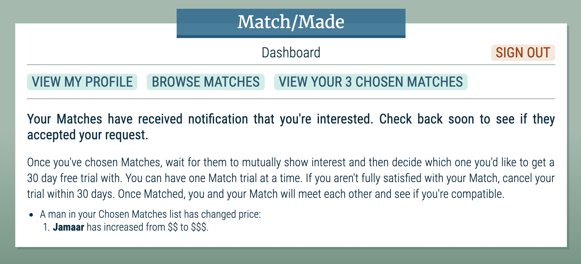
A match increased in price
I chose a unisex name for the main character since I wanted players to choose their gender to make the experience feel more relatable. Even Riley’s last name, Metanoia, has intentional significance. I also put external links into the game to better inform the player.
Game Creation Software
For this project, we could use either Inform or Twine to build our game. Inform is more of a user-input-based game format where players can type commands into a field to control the flow of the game. I am personally not a fan of this game format; playing games that use this feature ended up frustrating me more than delighting me so I decided to use Twine. Twine is an intuitive interactive fiction story/game builder that allows you to easily create passages that connect to each other based on macro-expanded links. The tool is very easy to use but because of the dynamic nature of my game, I ended up putting a lot of the flow of certain scenes into the JavaScript of the passages themselves. Texting your sponsor, for example, was all done in one passage with sub-passages conditionally loaded into the main passage depending on which game level you are on. The conversation with the person you meet at the park, however, was done in traditional Twine form where each response that you give goes to a different passage in the tree. Overall, I found Twine an excellent tool for quickly creating stories.
Twine itself comes with different story formats. Some cater more to beginners who have little programming experience. I chose the Snowman format which has less macro support but gives me more flexibility to use custom JavaScript code, which was necessary for me to create the game experience I desired. One challenge I faced was that since my game has variables that change as the player progresses through each level, I needed a way to retain the state if the page reloads. I used local storage to solve this problem. I also wanted the browser to restore the location in the game if the user reloaded the page, so I added a parameter to the URL that would be parsed in JavaScript when the game loads so it can show the right passage. This also made debugging and testing my game much easier.
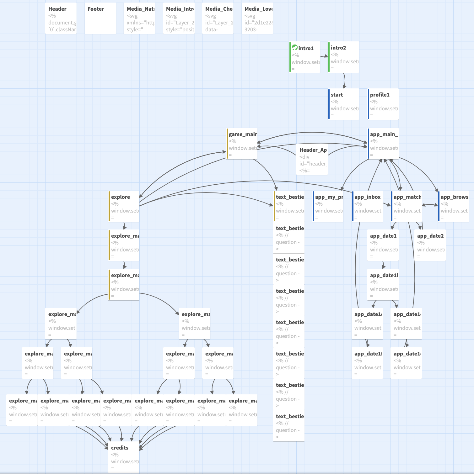
Twine game flow chart
Future Ideas
As with any passion project that I take on, cutting it down to size is always one of my challenges. I tend to bite off more than I can chew and this project is no exception. Even though I mostly stuck to the minimum viable product that I envisioned (note that the original game idea got sized down considerably due to time constraints), I still went above and beyond with the CSS and JavaScript to finetune the look and feel of the game. There are still so many more features that I’d like to add to the game if I get a chance to continue working on it in the future. In particular, I think it would be interesting to see how a true rating system would impact the app. Right now, Riley receives a rating when she gets rejected but she has no awareness of the ratings of others. I also think it would be interesting to add a way for Riley to have a positive Match/Made experience where she meets someone promising and then has to decide whether to continue on that route or further pursue things with Jordan, the stranger she meets in the park. I also think that making the game more Amazon-like with filtering and other features would really make the app feel more like a catalog of candidates. Having Riley actually complete a psychological exam would also be intriguing since it could introduce a way to change the direction of the game depending on whether she passes or fails. I’d also make the gameplay longer and more intricate to develop the characters a bit more.
What I Learned
Whew. This is where I get very honest with my audience…and myself. This project was a long yet amazing experience. It was a lot of hard work but that was mostly because I wanted to portray a specific game world and I didn’t want to cut any corners. I learned a new tool (Twine) which is always awesome. I will definitely use it again for future projects. If I could do anything differently, however, it would be to not take on quite so much when I’m not feeling well. I got very sick at the start of this project and since I’d already committed to my idea, I didn’t want to change it to something simpler because I work really hard to finish what I start and try to do it to the best of my ability. In hindsight though, I probably could’ve done much less and still achieved the same goal, although likely less effectively. I struggle with giving anything less than my best, even when I’m not at my best. In fact, I’m pretty sure that I got sick because I’ve been working myself too hard this quarter, trying to juggle two classes and a full-time job. …Like a crazy person. That being said, I’m glad that I got to finish this project and I really appreciate the course staff for giving me an extension which gave me the opportunity to execute my vision without sacrificing the quality of the game I wanted to create.
Overall, I’m very happy with the way my game turned out. I think it presents an interesting tug-of-war between pathos and logos: the struggle between our emotional and logical sides. It is this delicate imbalance that Riley has to gripe with on her journey to finding a life partner and ultimately finding herself. I enjoyed creating this game and look forward to experimenting more with interactive fiction!
For easy access, you can also play the game below. Enjoy!